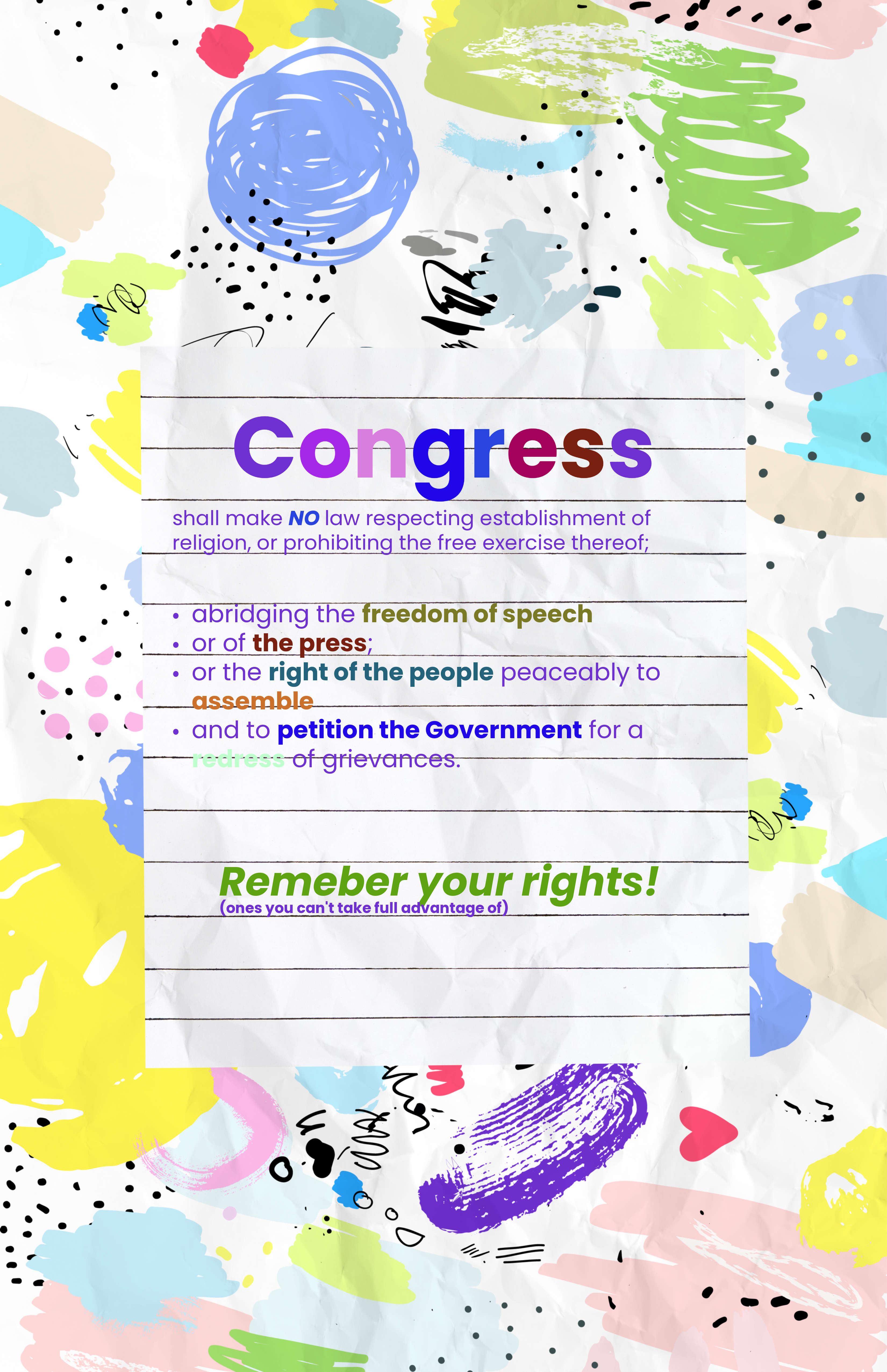
I was given the prompt to make a first amendment rights poster for kindergarteners so I went for a colorful crayon approach. It actually doesn't look half bad!
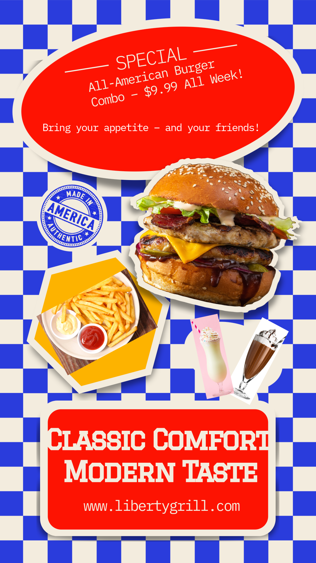
This time I had to make a flyer for a new resturaunt. It specifically goes with Unity and its four elements. 1:Proximity-The images are close, giving an almost closterphobic look. 2:Repetition-The images are all skewed and in a skewed outline thingy. 3:Similarity-The fonts and colors are all consistant and similar looking. 4:Alignment-The background and images are alligned together, they have the same skew or the opposite, they're alligned around eachother.